The rule of thirds is the basic knowledge of composition that most photographers use when placing items within the frame to make a picture. While it's an incomplete foundation of a composition, it is certainly worth learning and understanding as you learn the basics of photography.
In its most basic form, the rule of thirds says that you should imagine a tic-tac-toe board on the frame of the picture, and then place whatever is most interesting in the photo on the intersection of those lines. But the rule of thirds also helps with placing larger items in the frame by placing them along the horizontal lines of the rule of thirds.

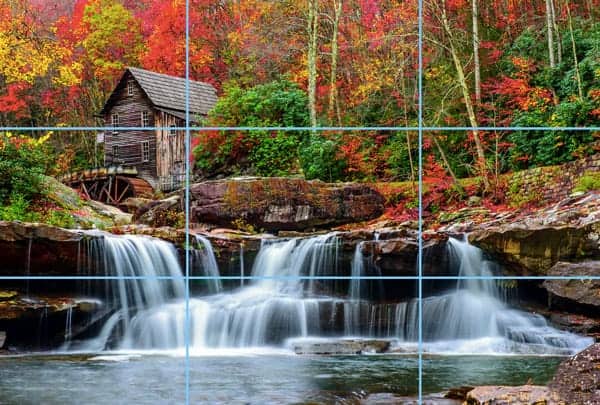
In the photo above, I imagined their were two horizontal lines (thus making three segments of the photo–that's why we call it the rule of THIRDS) and then two vertical lines on the frame. Then, looking through the viewfinder while imagining these lines, I placed the most interesting part of the composition–the mill in this case–right on the intersection of those lines. I could have picked any of the four intersections, but this one seemed to make the most sense in this instance.
But the rule of thirds is not always quite that clean-cut. Look at the example below. What's the most interesting spot in the frame? Probably the center of the city, but it's really just the city as a whole that is interesting. It would certainly be peculiar if I would have zoomed out and included more water just so the city could be tiny up in the intersection of the lines.
So in this case, I just put the top of the mountain along the top third line, and the water line across the bottom third line. It's not placed at the intersections, but just across the lines. It still follows the rule, just not as neatly as the example above.
Also, you'll see that I put the boat in the bay at the bottom-left intersection. It's a nice touch even though it's not the ultimate focal point of the photo.

Okay, so you have an idea of how to apply the rule of thirds to landscapes, but what about portrait photography?
In portrait photography, the rule of thirds is applied to the eye line. When I look at portraits from newer photographers, I often see them placing the subject's eye line too low in the frame. Most newer photographers place the eye line in the middle of the frame,which leaves far too much head room (space between the top of the head and the top of the frame).
Professional portrait photographers almost always place the eye line along the top third-line of the frame. This leaves an appropriate amount of head room, but also puts the model's face slightly off-center which adds interest.
Now that you've learned that, you'll notice it everywhere! Even on TV, you'll notice that when a single person is in a video shot, the person's eye line is usually on the top-third line of the frame.
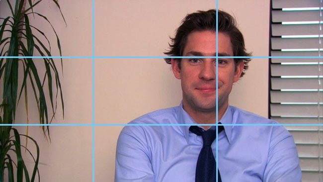
Let's critique this image from my favorite TV show to help drive this point home.

An amateur photographer, or videographer, would place Jim Halpert from the hit show “The Office” (the American version) in the center of this picture. However, they have chosen to place him over to the side and up higher in the frame to follow the rule of thirds. You'll see that they didn't get it perfectly lined up with the rule of thirds, but it's close enough.
It would be very remiss of me to not throw in a joke about “Meet my eye line, Jim!” If you haven't seen the NBC version of the show “The Office”…. then just move on. If you have, well then that last little line was hilarious 🙂

Why it works
The rule of thirds works because it adds interest to the scene by balancing an object with “visual mass” with a larger area of negative space.
An object with “visual mass” is what the viewer's eye is drawn to when he or she looks at a photo. When you see the portrait of this couple, your eye is immediately drawn to the couples' faces. They have “visual mass.”
To balance out the fact that the faces are the most interesting, you have to use a much larger area of “negative space.” Negative space simply means a portion of the photo that is mostly blank. In this case, it's the tin wall to the right of the couple.
By using the rule of thirds, the couple is placed on the top-left intersection of the frame (simply because that's the intersection that felt the most natural to me). Since they are very interesting, I need a LOT of blank wall on the right to balance them out.
That's why the rule of thirds makes a composition feel balanced, despite the fact that the people are off-center.

Limitations of the rule
I mentioned in the beginning of this article that the rule of thirds is a great foundation for understanding composition in photography, but it's certainly not everything.
I encourage my photography students to learn and adhere to the rule of thirds for the first while as you learn photography, but to recognize that there is much more to obtaining a solid composition.
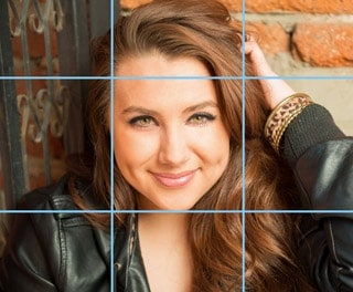
Let me show you an example of where the rule of thirds falls flat on its face. When I was photographing this model, her expression really caught my eye. It conveyed so much that I asked her to freeze and let me capture a dozen or so photos of this expression.
The photo I ended up liking most from this setup was this one. It violates the rule of thirds in every possible way, but since her face is so full of expression and mood, it feels like putting it in the center creates more drama.
So the rule of thirds isn't everything. I break it all the time.
In fact, I've been writing a book on photographic composition and I came up with a rule that I feel explains solid compositions much better than the rule of thirds, but it's a bit outside the scope of this article. If you're really interested in learning it, though, you can get my Photography Start class, where I have a video teaching Block Method composition.

Where did the rule of thirds come from?
The rule of thirds dates back to Sir Joshua Reynolds in the year 1783, but the first recorded writing of the rule is merely quoting Sir Joshua Reynolds as having taught it. There very well could have been others at earlier points who promulgated the rule.
The ancient masters of art (including Da Vinci, and others) believed that no negative space in a painting should be the exact same as any other area of negative space.
The rule of thirds assists the artist in following that rule by harmonizing areas of greater visual mass with areas of negative space, and not placing the area of visual mass in the center, which would then leave equal negative space on either side.
Ready to learn photography? I have a completely free 8-page photography basics article that will walk you through all of the most important fundamentals of using your camera to get perfect exposures and crystal clear sharpness. I call it the photography basics series, and you can read it here.

Thank you for explaining this concept so clearly! I’m just starting to take photography a little more seriously and whilst I’d heard the phrase ‘rule of thirds’ I really didn’t understand it before. I will start to use that technique, thank you! 🙂
Composition is the structure of a photograph. If structure is faulty then entire work suffers. For more than 21 years I am experimenting with compositions primarily in Street Photography and I will say this to freshers : Learn well the grammar of composition so that its a part of your system and then forget it. Start experimenting and grammar will play its part at a subconscious level.
I agree with the Rule except when, as in your example, the suject is looking out of the frame. I feel the pic should always be restructured so they are looking into the frame. Just my preference.
Also, in the womans photo, I feel the hand up the side of the head makes her look like she didn’t know what to do with her hand. Every photographer uses that pose and it rarely works. Very few models can do that pose and make it look natural. To me, that says the photographer didn’t work with her enough. Not specifically you since you were just illustrating your point.
Just my thoughts.
SUDDENLY I CAME ACROSS UR W.SITE & TRULY GRATEFUL 2 U FOR EXPLAINING THE CONCEPT SO CLEARLY . U R REALLY HELPING NEW COMERS IN THE FIELD. MAY GOD BLESS U & UR TEAM .
I have been learning a lot about the rule of thirds lately in my journalism classes. I have taken some pretty great photos, I think, and really want to have some framing done for them. One photo that I especially like was taken on a midnight hike up the mountain. It is a really dark picture but it perfectly portrays the mountainside with the valley full of lights below. I am thinking that a black custom frame would be the best.
Thank you for all the information. Your website, youtube, couple of books and magazines are what helps me understand photography. I never realised it’s very interesting. You are deeply appreciated.
-Aisza
Arlm’z View
Thanks you for your tutorial, very simply explained and great for new photographers as myself.
Thanks for this lesson! I know so little about photography, but really want to take better photographs. What do you recommend for big family pictures?
Linda
Thank you so much for sharing this useful article .
Hi, the rule of thirds, probably, is the first thing the person learns looking for a possibility to take better pictures. I like one simple rule – frame your image in the way that is pleasing for your eyes. It works pretty well, but more attentions to composition is neded if you want to reach higher levels.
My younger sister dreams about becoming a professional photographer one day. That is why I got her a new camera for Christmas. I think that this post will definitely help her understand more about how to better take pictures. I love how this simple technique can show a lot of detail. However, are there occasions when the rule of thirds should not be used?
The rule of thirds quoted in the wikipedia article is completely different.
The rule of thirds described here originated in the 20th century as a shortcut for photographers, and is basically modern nonsense that boils down to “don’t stick the subject in the middle, unless that’s a good idea, in which case do so”.
Hi:
I just wanted to say I really like this website. I think any website that is geared to helping artist/photographers improve their work is great. I read a few of your articles and have to say I like most of them.
I came across this article on the rule of thirds and just wanted to give my input here. I’m sure I will get a lot of hate mail after but, you seem like a very open person to learning new things as I am.
I have been studying design over five years now and, in my experience, the rule of thirds is severely limiting in composition and most master photographers don’t use it. Most master artists use Dynamic Symmetry, including Henri Cartier Bresson, whom you mention in another article. Using the 1.5 rectangle to design in, you should use the armatures of the rectangle, not divide it up into a grid of thirds. Design is more precise then that, and also, the rule of thirds doesn’t even consider diagonals, which are critical in all composition.
In my option, the rule of thirds really doesn’t work. When you study great artists, including many Magnum photographers work, they break their images, meaning their horizontal, vertical and diagonals lines using the golden section system of design, aka Dynamic Symmetry. When I say the golden section system of design, I’m not specifically talking about a golden section rectangle, which is the 1.618. In Dynamic Symmetry your using root rectangles as well. What HCB did was memorize specific division points based on overlapping root 4 rectangles as well as the basic armatures of the 1.5. He didn’t use the rule of thirds.
I know I will probably get booed and hissed at after writing this, but the reason I bring it up is because I see so many websites that discuss the rule of thirds, and as Myron Barnstone has said, to only know the rule of thirds is to be poverty stricken.
By studying formal design, Dynamic Symmetry, I think you would be amazed at what master artist really do in their work and also be amazed at how precise it truly is. Even though HCB mentions not thinking too much, that is misleading because he was trained by a master designer, Andre Lhote. The truth is, HCB learned Dynamic Symmetry through him and memorized certain division points in the 1.5 rectangle. Thats why his work is so accurate and thats why he says to never crop his images. He didn’t crop them because he knew, if any amount was taken off, the master underlying design was destroyed. Thats how critical design truly is.
You can go to my website, I mention Dynamic Symmetry all the time and have free downloads and recommendations to learn about it. I don’t make any money on any sales on my website. I mention material and information to help other artists.
Thanks for your time.
Jim
So informative. My intuition has been dead on with nature, but with individuals, I now have a new strategy! Thank you
Thank you for this article, simple and elucidative.
I disagree. I think the rule of thirds has acted as a restraint to creativity. This is an informative article on its pitfalls:
https://petapixel.com/2016/01/30/10-myths-about-the-rule-of-thirds/
Thank you for putting this out. It helped me so much. ????