It is possible to have too much of a good thing. – Aesop (c.620-560 BC)
I always find it interesting that we refer to our unprocessed photos as RAW files and the parallels I’m able to draw between the processing and editing of photos and cooking. You start with uncooked ingredients, combine them and cook them to make something tasty, add just the right amount of seasoning and, if you are a good cook, serve up something that makes people say “Mmmmmm!” Do it wrong however, especially if you add too much of or the wrong seasoning and the sound you hear may be closer to UGH! Let’s talk about ten ways photographers too often improperly “cook and season” their images.
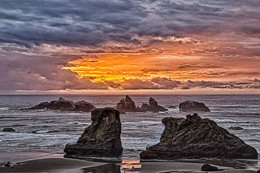
First, a little bit of a disclaimer if you want to call it that. I purposely had to “ugly up” some of my images to illustrate the “don't dos” I want to discuss here. It's not that all of my images are great and that I don't make editing mistakes. I just wanted to take it to the extreme so you could easily see what I'm talking about. No subtlety here. If your images look like any of these you are really overdoing it and this article is definitely for you!
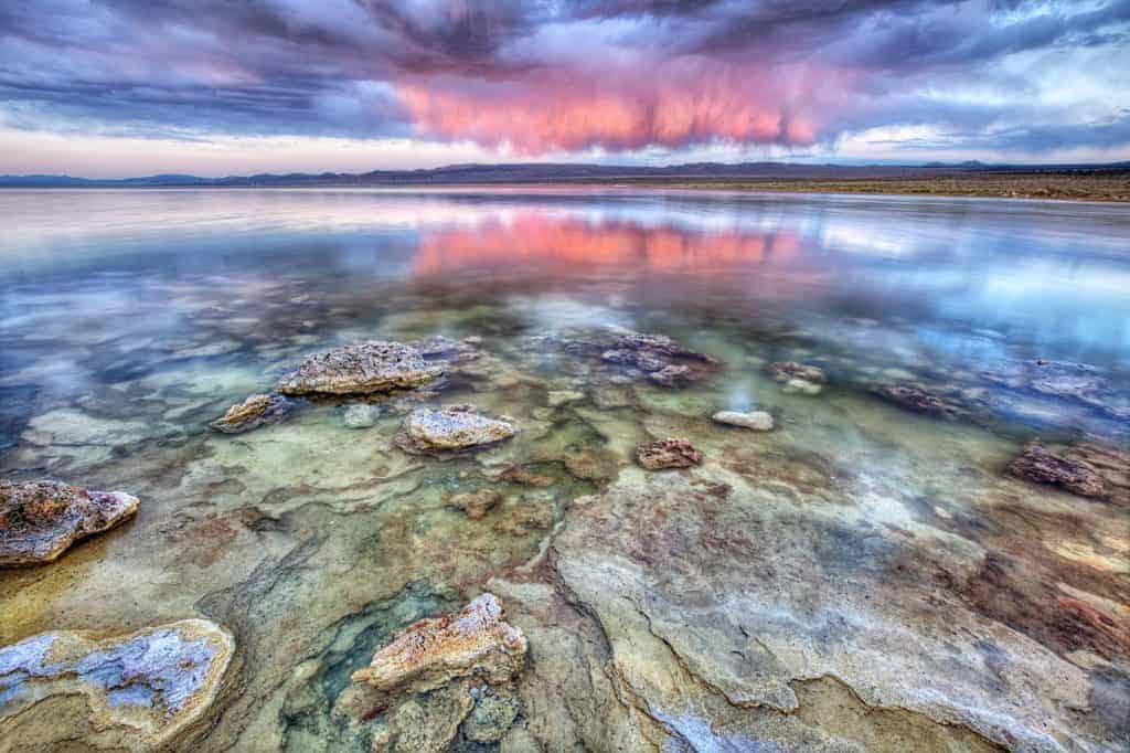
1. HDR
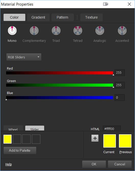
HDR is the acronym for High Dynamic Range. It is a technique used to compensate for a problem cameras have – Low Dynamic Range. Let me explain what that is. The Dynamic Range is the range of tones from total white to total black. In the digital world of photos, luminance is expressed in a range of 255 tones with 0 (Zero) being pure black and 255 being pure white. Color is interpreted as a mix of the luminance values of each of the colors that a sensor can “see,” Red (R), Green (G), and Blue (B). Thus, when you see the term RGB, this stands for Red, Green, and Blue. Any color can be expressed with this formula. Pure Red would be 255, 0, 0. Pure Green would be 0, 255, 0. Pure Yellow, which is a mix of Red and Green would be 255, 255, 0. With 24-bit color, 16,777,216 unique colors are possible. (32-bit color adds another 8-bit transparency channel.)
Now, as far as Dynamic Range, modern digital cameras have an “original dynamic range” of from 10 to 12 stops. Prints are much lower, about 6.5 stops and that is also about the contrast ratio the human eye can detect. So why do we think we can “see” better than our cameras? The answer is not in the optics of the eye or camera sensor, it’s because we humans have brains. Our eyes scan the bright part of a scene, the dark parts, and construct the scene in the brain. You can explore the subject more in depth here. The better question for this article, however, is why we use (and sometimes abuse) HDR techniques.
What we really see is our mind's reconstruction of objects based on input provided by the eyes — not the actual light received by our eyes. – Cambridgeincolor.com
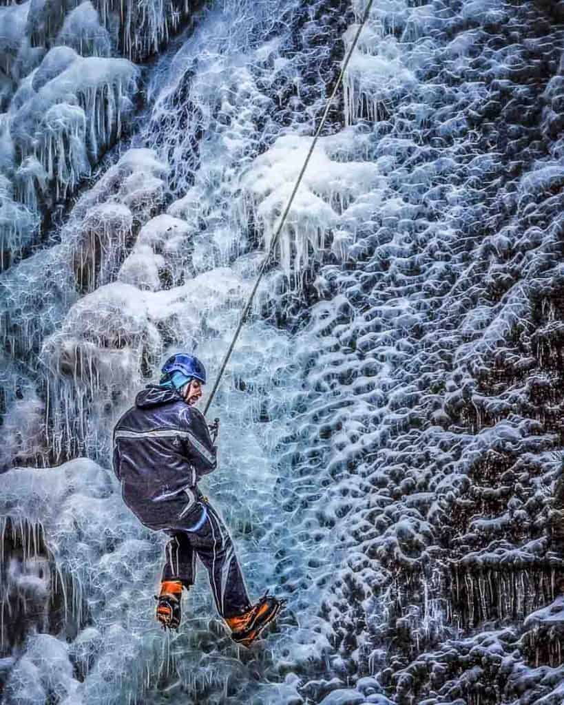
The typical technique when creating HDR images is to shoot multiple shots of the scene, some underexposed so that the dark portions of the scene are better seen, some exposed for what the camera meter says is “correct”, and some underexposed so that the highlights are preserved. Then, typically using special HDR software tools, those images are combined with a technique called “Tone Mapping” so that the resulting final image “stretches” the tonal range. A good example – You are shooting an interior of a home with lots of windows. If you only take one shot, properly exposed for the interior, the view out the windows will likely be overexposed. Expose for the bright scene outside and the interior will be too dark. But, take multiple shots, combine them with HDR, and you can get a final image with both inside and outside properly exposed. Great huh? Unless you overdo it. It’s quite easy to get carried away with HDR and have a resulting image that looks unnatural, grungy and back to that cooking analogy – Overcooked.
How much is too much? Like seasonings in a dish, that is often a determination of the cook/photographer and the diner/image viewer. What might cause someone to say “Mmmm” would cause the next consumer to say “UGH!” I won’t begin to tell you how much is too much when it comes to HDR processing, that is a personal choice and varies greatly in what it is you are trying to show with the image. Just know that HDR processing is a powerful tool and remember what Uncle Ben told Peter Parker aka Spiderman –
“With Great Power Comes Great Responsibility.” – Ben Parker to Spiderman
2. Over-use of the Clarity Slider
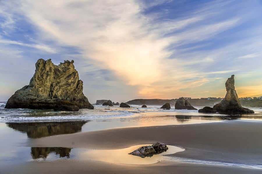
In Lightroom, (and also in Adobe Camera Raw), we have what is called the Clarity Slider. What does it do and why do I caution against its misuse? First, what it does is increase mid-tone contrast. Our eyes detect areas of higher contrast as being “sharper” and so while it doesn’t make anything truly sharper or increase clarity, it makes it look like it. It has its greatest effect on mid-tones. Highlights and shadows are affected to a much lesser degree. It can help images and most often I will add a little Clarity to my photos. The key word – a little. Like salt in the soup, a little can enhance, too much and – UGH! The mid-tones will look “crunchy.” You might get “halos”, bright or dark bands that follow the edges where light and dark areas meet, such as where dark mountains meet a bright sky or tree branches are against the sky. Double-UGH!

Use a lot of clarity on a portrait of a grizzled old cowboy and it might be nice, bringing out his rugged features. Use too much on a photo of a beautiful young woman and you will age them 25 years…usually Not good. In fact, for portraits of older people where softening skin might be a good thing, I will often brush in a little Reverse Clarity in Lightroom with the adjustment brush. Drag the slider to the left, to the areas below zero. Use it on the face where you want less detail and more softness. Avoid the eyes and teeth where you still want sharp clarity. Don’t overdo it or the person will look “plastic”, like a Barbie doll. The best advice when using it, (and this applies to all the techniques here as well as cooking too), if it draws attention to itself, you used too much.

3. Highlights/Shadows Overdone
I learned Lightroom by watching Serge Ramelli tutorials on Youtube. One of the first things he does in his editing workflow, (and I’ve since learned this is quite common), is to bring down the highlights by dragging the slider all the way to the left and open up the shadows by dragging that slider all the way to the right. This stretches the histogram. The detail in both the shadows and highlights is enhanced. He then sets the white point by holding down the Alt key and dragging the slider to the right until the whitest points are seen, then slightly backing that off. He sets the black point by also holding down the Alt Key and dragging the slider to the left until the darkest black points are seen.
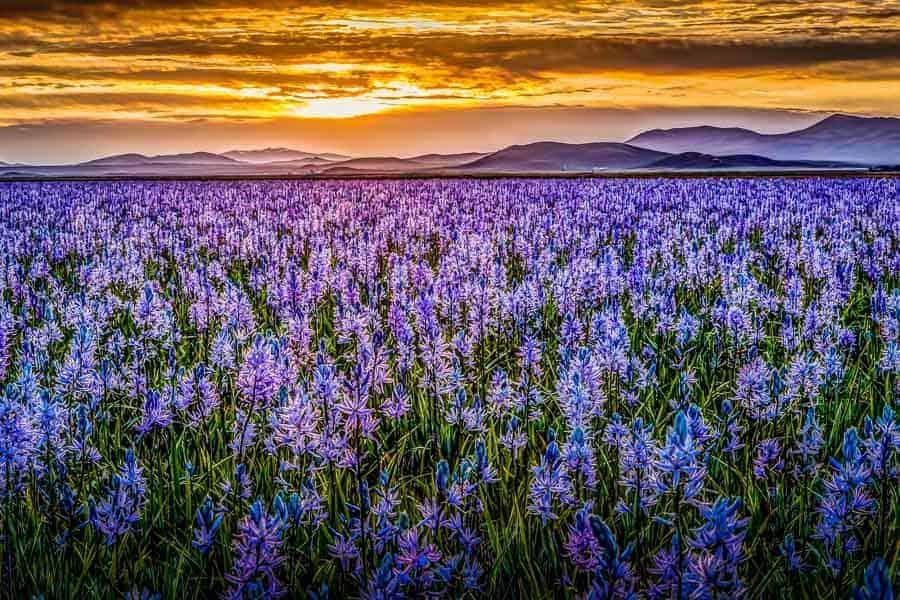
It’s a good workflow and I’ve used it for thousands of images. But again, the seasonings analogy, the “dish/photo” you are creating may require you to adjust how much you use to get it “just right.” They’re called adjustment sliders because they’re meant to be adjusted, allowing you to you to tweak the settings for the individual photo you’re editing. Too much and you will get a look very much like an overcooked HDR image and that same reaction from more experienced photographers – UGH!
4. Slider Overuse
Lightroom has all manner of sliders for adjusting things. Most are useful, used in moderation. Too often though, inexperienced editors will think if some is good, more is better. I’d suggest completely the opposite. Unless you are going for a special “look”, moderation is a good thing. Any adjustment that calls undue attention to itself is a bad adjustment. Back it off until it’s just barely discernible. You will know what you did, but to others, your photo should look completely natural. One slider to use judiciously is Contrast. Too much and you’ll crush your blacks and blow out your highlights. Too little and your image may be flat and muddy – all mid-tones.

Something else to beware of is the use of presets. While they may be shortcuts to getting the look you want, know that all presets do is provide a “recipe” of slider settings. Some can do a nice job, others… well…whatever floats your boat I guess. Just know they are adjusting sliders “under the hood” to get the look they achieve. Feel free to use them, but perhaps back off things that go over the top.
“Intoxication is when you love something to excess.”
― Anthony T.Hincks
 5. Over-Saturation
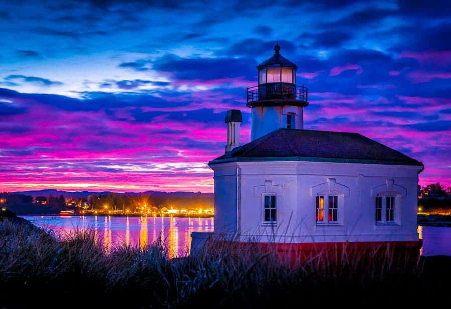
You’ve been to giftshops where postcards of scenic vistas of the area where you’re traveling are sold. They are meant to be “pretty”, catching the viewer with highly saturated Disney-like color. Is that what your eye saw when you looked at the scene? Neon-like color? Nuclear green foliage? Of all the sliders in Lightroom, the one I very rarely use is Saturation. A far better option is the Vibrance slider. The Saturation slider increases ALL colors in your image uniformly while the Vibrance slider only saturates the colors that are already undersaturated. Use the Saturation slider on a portrait and you may easily give the subject a bad sunburned look. A touch of the Vibrance slider, however, may bring a nice healthful look to a pale-skinned subject.
6. Over-Sharpening
Let’s talk about what Sharpening is and what it isn’t. Sharpening is NOT a fix for out of focus images. Of all the things you cannot fix in a photo if you get it wrong, focus is at the top of the list. Shoot an out-of-focus image and you might as well delete it… there is NO tool that can make it acceptably sharp again. If you believe otherwise, please share what that software tool is because I’d pay good money for it.
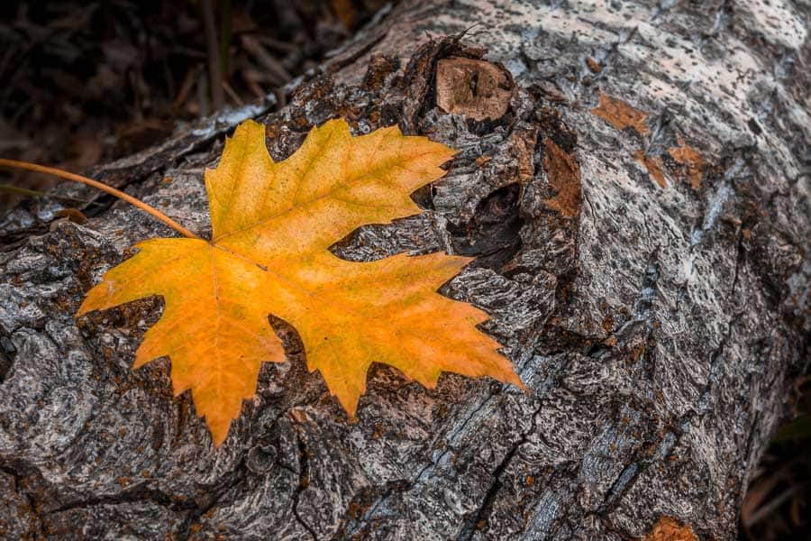
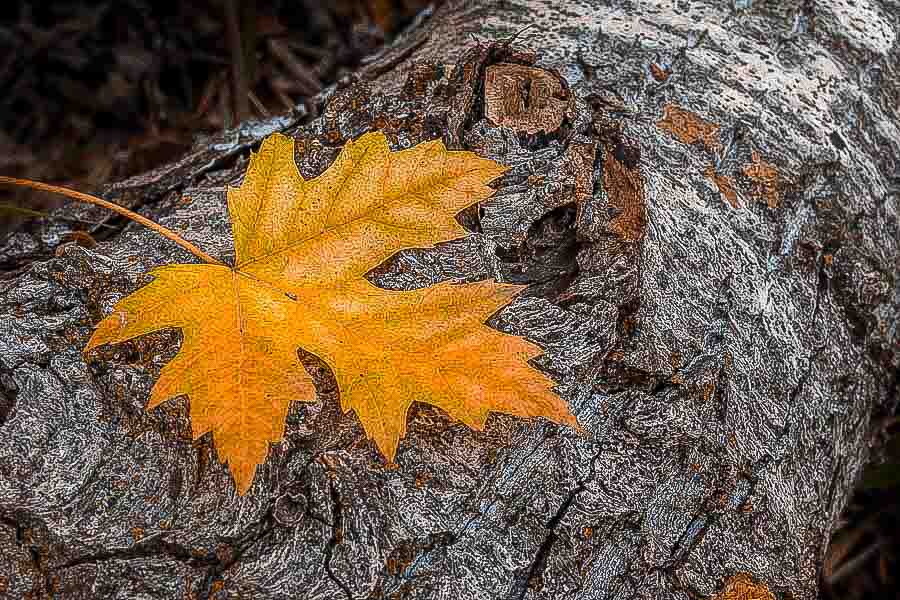
So what is Sharpness? All that Sharpening does is increase the contrast between adjacent pixels, particularly along edges. Using it will increase the apparent sharpness of an image. It may help a very slightly unfocused picture, but it needs to be thought of as an Enhancement, not a Rescue tool. Notice the problem is Oversharpening. Taken too far, it will make your images look crunchy, introduce halos, and mark you as an unskilled editor. That said, all images should be sharpened to some degree. So when, why and how?
If you shoot .jpg images, the editing algorithm in the camera will apply some sharpening to your image. Remember that when you shoot in .jpg you are allowing the camera to make some editing decisions and that those are “baked in” to the image. Again, the cooking analogy… you probably want some sugar in your cookie recipe, but how much? The .jpg algorithm decides how much of anything should go into the photo and applies it. Raw images, however, are “uncooked,” you decide how much of this and that should be added. It took me a while to get my head around this concept when I made the leap from shooting only .jpg to shooting Raw. My .jpg images looked pretty, but the Raw images straight out of the camera were flat and lifeless. Huh? Oh… now I needed to be the “cook.”
At first, the .jpg algorithm was a better “cook” than I and sometimes I felt the Raw editing process was more of a rescue operation. But, as I learned to properly process my Raw images, I learned that it gave me the freedom to make things look like I, not the camera, thought they should look. When I learned that white balance could be adjusted AFTER the image was shot, it was a revelation. No longer was I stuck with a poorly chosen white balance setting or a green skin tones on portraits taken under a leafy tree.
So, ditto for image sharpening. Raw allows sharpening to be done to your taste, not the cameras. It also allows localized, brushed on sharpness, not global sharpening to the entire image. Raw files will always be unsharp. Even the best lenses still lose some sharpness as light passes through the elements. Combine the RGB channels from a sensor and still more sharpness is lost. Attracting a viewer’s eye to the parts of an image we want them to look at is how a good photo is made and the human eye is attracted to contrast. Sharpness is how we do it.
I could easily write several articles on the tools for sharpening images, how much to sharpen, and sharpening for screen viewing vs. printing. I’ll save that for others. The point is, learn how and when to sharpen your images and what oversharpening looks like. Sharpening is a powerful “spice” and when done right, it will greatly enhance the flavor of your photos. Too much however and… you guessed it… UGH!
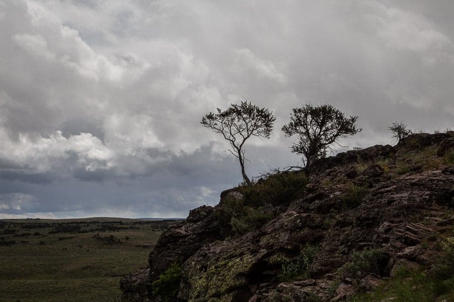
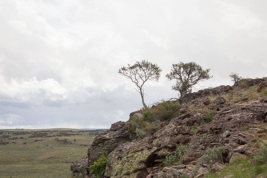
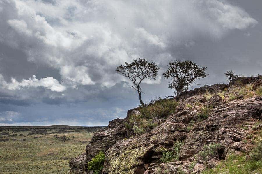
7. Global vs Local Adjustments
This is a pretty simple concept to grasp, but only with practice will you come to understand how best to use it. Move a slider in Lightroom or Photoshop and the entire image is affected. If it’s the Brightness slider, the entire image will brighten. That’s a “global” adjustment. But what if you only want to brighten a subject’s face? Go for the Adjustment Brush and brush on that brightness adjustment only where you want it. That’s a Local Adjustment.
The problem occurs when new editors don’t fully grasp what can be done with local adjustments, don’t learn how to combine the adjustments available with the adjustment brush, or perhaps are just too heavy-handed with the localized adjustments they make. Again, too much misapplied and it will draw attention to itself like too much salt in the soup. The beauty is, Lightroom will allow you to back off the intensity of an effect you apply, whether global or local and if you use layers in Photoshop you can also adjust the intensity of an effect if you decide it needs more or less. You can’t take the salt out of the soup if you decide you added too much but in the digital world you can back off or turn up adjustments if to get things “just right.” The trick is learning what “just right” looks like and that only comes with editing experience.
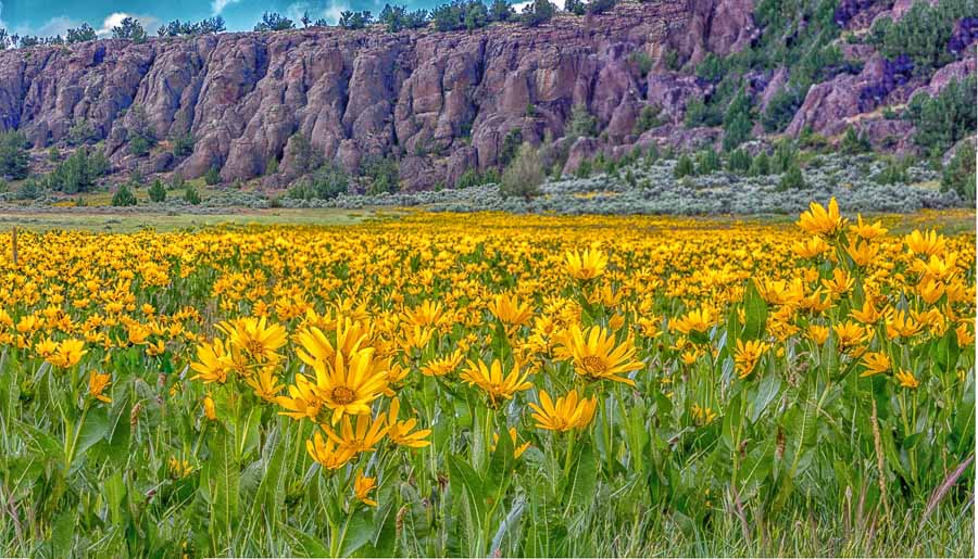

8. Third-Party Plug-In Filters
There are a whole collection of add-ons and plug-ins you can get to use in combination with Lightroom, Photoshop, and many of the other editing programs you might use. They provide all manner of editing tweaks and special looks. To name one, let’s use Nik Color Efex Pro and the specific effect Detail Extractor as an example. Used in moderation, it’s a great effect, bringing out details in your shot that will give the image extra polish and pop. But, it’s like Tabasco… too much and yup… UGH! What and how much, that’s up to you. I’m guilty of this… I get a new software filter or plug-in and it’s like a new toy, I’m excited by what I can do with it and try it on all kinds of images. Only later, sometimes years later, I look at images I gave that “special treatment” with the effect I thought was so cool and wonder, “What was I thinking??!!”
“Nothing is more self-limiting than going to extremes.”
― Marty Rubin
9. Gimmicky stuff
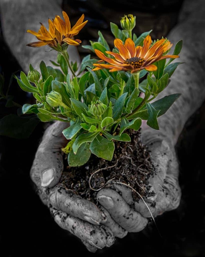
That brings us to some of the “out there” things people do with their images, things you’re not likely to see serious photographers touch with a ten-foot pole. Yeah, I occasionally play with spot color, those images where you make the photo primarily black and white except for a feature you want to draw attention to. I sometimes think it’s nice, but know that I do so at the risk of not being taken seriously by more professional photographers. I’ve played with those tools which can add a false water reflection at the bottom of a frame making it look like there was a lake or other water feature in a place where there wasn’t. I’ve put starbursts on light highlights with software and a fake sun or sky in a shot that didn’t have it. Do it well to make it believable and “transparent” to even savvy fellow photographers and you’ll get raves. Do it poorly and you’ll be like the rookie magician whose tricks fool no one and only earn boos. If you want to try the more gimmicky stuff, practice until you are good before you show your tricks “on stage.”
10. Pixel Blindness
I’m not sure this is a widely used term, but I’ve heard it amongst photo friends and think it’s a concept with which you should be familiar. “Pixel Blindness” occurs when you’ve spent a long time working in front of the computer screen on an image. You’ve tweaked it, cropped it, made local adjustments, done your magic on it. You might have doubts about whether a certain adjustment is right or if that special effect you applied is convincing, but you soldiered on with the edit session.
The problem is… too much time in front of the image and you may have gone “Pixel Blind.” It’s used to describe the phenomenon of losing objectively by staring at the image too long. The cure – Take a break away from the screen for a while, get up, stretch, get a cup of coffee, go for a walk, or even get some sleep and look at it tomorrow. You need to get away from the image for a while and regain that objectivity again. You will be amazed how something that seemed “just right” may evoke a completely different reaction when you look at it with “new eyes.” You also sometimes find something you struggled with and had doubts about looks just fine after a break. The mistake you will make is when you don’t look at your images sometime later and what you thought was great hits you right in the face. Usually, that happens when you show your image to a group or print it and only then see your error. Doh! Take a break… it makes all the difference sometimes.
Photographer Oversensitivity to Critique
There’s a whole collection of tools and techniques you can use to edit and enhance your photos. Photography is art and there are no “rules” for art. You might like your eggs scrambled with ketchup and I might like a fried egg over easy with a little salt and pepper. Who’s right and who’s wrong? It’s subjective. Now, that said, if you never invite others to critique your images and, even more so, are not open to comment and criticism about your work, you will never grow as a photographer. The minute you are closed to the opinions of others is the minute you begin to stagnate.
I know, our photos are our “babies” and everyone thinks their baby is beautiful. Let me break it to you, not all babies are beautiful and your photo “baby” may indeed be ugly, or at least in need of re-editing. I belong to a photo club where we routinely show our prints and projected images for judging and critique. Sure, it’s nice when they earn good scores and the kudos of my fellow photographers, but I learn far more when a weak image is presented and I learn from my mistakes. If all I wanted is “Nice Photo” comments, I would only show my work to friends on Facebook (or maybe to my Mom.) No… I seek out candid and even harsh criticism as a means to learn and grow.
Yes, I also reserve the right to stick to my guns when I consider the feedback invalid, inconsistent with my objectives for the image, or perhaps only the opinion of a “misguided, unskilled, ignoramus.” (grin) But I try to maintain a thick skin, weigh the opinion, and sometimes begrudgingly have to agree they were right. Those are the times my photo skills grow a bit more.
The Take-Away
So, my message for you after reading this article is to give consideration to the images you are making. Are you guilty of any of the over-processing sins I’ve outlined? Could your photos be more “tasty” if you backed off of some of the extra “spice” you’ve been using or learned to be a better “cook?” Might you benefit by serving up your work before a group of knowledgeable “photo gourmets” who know good photography from bad? Are you receptive to honest and informed criticism and ready to use it to grow your photography and editing skills? Give it some thought. I’m hoping you’ll continue to improve your photography and become a “Master Photo Chef” creating the most delicious images we’ve yet seen.

So like this article. Right on point.
Great article. Very useful. Thanks.
Great article. Food for thought
Well put. Some excellent points made here. I love reading an article where I learn something and this one did just that
I’m so happy I seemed to hit the mark with this one. Having made most of these mistakes myself I feel I learned from experience and now perhaps you can learn from my experience. Thanks gang!
Loved the article! Not only is the information a reminder not to “overcook” but also I learned more about color range and sharpening.
I’m not a new photographer but I’m also not a professional. I read to learn and this was a particularly informative and well written piece. Thank you Rick.
I’m flattered! Thanks so much. 🙂
Well done article Rick with lots of good & helpful tips to not “over cook” a image. Thanks for taking the time & effort to be a good teacher…
This is a great article and each point is spot on. I try to save various versions and will often go with the more lightly processed version as a “final edit.” Of course we DO have to process our RAW images to coax what we want out of them. Some of the best images are skillfully processed to a high degree, but we just can’t tell because the editing has been done with many of this article’s tenets in mind.
Nice article Rick! I am guilty of several things you have mentioned. Maybe several times on the same item. Good article to reread every so often just to refocus your processing.
Great reminders. Thank You.
i read your article few days ago when i woke up by the moon shine filling into my room (around 3am) and i decided to take a picture of it. and it was amazing. and what the funny thing is only i use huawei nova 2i. didn’t expect such results. now i came back eager to learn more! thank you <3
I’ve seen a chart floating out on the internet that describes the learning process of photography. In this chart is the point where you learn to do HDR. The quality of your work drops at this stage, but it’s new to you, and eye catching. Unfortunately, some just never get out of that pit. I can foresee me linking this article to some people to gently pull them out of the HDR pit.
Yes, HDR is something many get excited about and, to continue with the cooking analogy, becomes like pouring extra sugar on your Frosted Flakes. It’s addictive and so easy to overdo. People also need to learn not to get defensive when other, more seasoned photographers, comment that you may have “poured a bit too much HDR sugar” on a particular photo. Nice to hear from you Jason.